Comparison between
Responsive and
Non-Responsive Website
When customers transfer from one device to another device, the size of the device changes. He expects that the website should be compatible with all devices whenever he changes the device.
Earlier websites were created for use on desktops, so they fit on a desktop. Now people use the internet on their smartphones. They expect to see their desirable content on their smartphones. Thus, it’s become very important to make your website look good on whatever device the customer wants.
Google has an algorithm in which the ranking factor is determined by the mobile-friendliness of a website.
So, this makes it important for you to learn responsive vs non-responsive websites.
Firstly, What are Responsive websites and Non-Responsive websites?
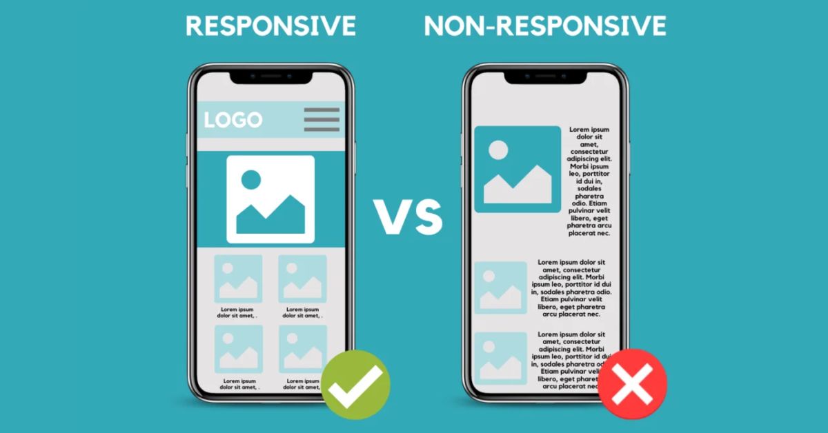
Responsive Websites are the sites in which users get the same experience with your website when they access it from any device available. Devices such as computers, laptops, tablets, and smartphones.
Whereas Non-responsive websites In order to accommodate multiple screen sizes, responsive websites display differently, reflowing to perfectly fit your tablet or smartphone. Unresponsive websites show up on various screen sizes but do not modify their code to fit those sizes.

Following are the points to describe responsive websites vs non-responsive websites
Image loading time
Every device shows images of a different pixel. When customers switch from device to device, image size changes due to changes in the screen size of devices. So this becomes very important to create a website that does not make changes between devices of different screen sizes.
A responsive website makes no changes whatever the screen size of the device. However, a non-responsive website has the same size of images as whatever devices you use.

Flexibility
As we noted above, a responsive website prevents images from losing impact from device to device. On the non-responsive website, on the other hand, you need to scroll a desktop device when seeing it on a mobile or another small-sized device.
Getting notice on Google
Due to lots of traffic, the website has to be higher in rank so that it can be seen on Google. If you are looking to improve in Google ranking responsive websites are good for it.
The non-responsive website fails to do so because it often fails to translate the efficiency of content.
Being User Friendly
Responsive websites help the images not to lose their impact when viewed on a smaller size screen. By making a responsive website, it helps the user in reading text and navigation too. Having a website that can optimize itself according to various electronic devices, helps users. By this, they can feel free to use any device to access your website.
Responsive design is not 100% responsive
Responsive design is not 100% responsive to all devices, sometimes the phone gets stuck, sometimes every device has a different size, so no matter how hard you try to make it responsive, it doesn’t make it 100% responsive.
Conclusion
Now you have the information about the responsive vs non-responsive websites. From the above-mentioned points, I believe that you are in favor of responsive websites when it comes to choosing between responsive and non-responsive websites. So that you can cater to the homogenous audiences having different devices with one responsive website.
Newly introduced screen resolutions might change the future
You already know based on above discussion, how websites used to feel like they were designed for a specific size screen, and then everything looked super weird if you weren’t using the “right” monitor? Well, that’s where all these new fancy screen resolutions come into play.
- Beyond the Standards: We’re used to stuff like Full HD (1920 x 1080) and maybe even 4K (3840 x 2160). But get this – there’s a whole range of newer, less common resolutions popping up. We’re talking about ultrawide monitors, super-tall phone displays, and even resolutions on foldable devices that change shape!
Why this Matters for Web Design
Think of it like this: Imagine building a sandcastle for a specific beach. Now, suddenly, the beach has doubled in size, with new dunes formed—whoa! Your sandcastle’s gotta change, right? That’s what’s happening with websites and resolutions.
Here’s the thing about responsiveness:
- No More One-Size-Fits-All: Websites today need to be like liquid; they gotta flow and adapt to whatever screen shape they’re thrown at. It’s no longer enough to make a site that looks great on your laptop and hope for the best on a phone.
- Thinking Outside the Box (Literally): With ultrawide monitors, we gotta figure out how to use that extra space without everything looking stretched. And tall phone displays? That means reimagining website navigation so you don’t have to scroll forever to reach the important stuff.
The Challenge (and the Fun!)
These new resolutions are exciting because they force us as designers and developers to think creatively. It’s about embracing flexibility and building websites that not only work on different screens but actually take advantage of their unique form factors.


Leave A Comment